| View previous topic :: View next topic |
| Which Design is Your Favorite? |
| Vertical Design |
|
25% |
[ 2 ] |
| "America Today" |
|
0% |
[ 0 ] |
| "Moving Forward, Looking Back" |
|
75% |
[ 6 ] |
|
| Total Votes : 8 |
|
Jason Tandro
Level 20: Guardian of Pandora
Rank: Moderator


Joined: 04 Dec 2004
Posts: 6491
 8,169 8,169
Location: Tiptoeing the line between confidence and arrogance.
|
 Jason Tandro Posted: Sun Sep 19, 2010 4:56 am Post subject: They're Changing the Dollar Bill Jason Tandro Posted: Sun Sep 19, 2010 4:56 am Post subject: They're Changing the Dollar Bill |
 |
|
The American dollar is in bad need of a makeover. Thanks to the Dollar ReDe$ign Project, we may now have some options.
Organized by creative strategy consultant Richard Smith, the Dollar ReDe$ign Project is soliciting ideas for the dollar bill of the future. "Our great 'rival', the Euro, looks so spanky in comparison it seems the only clear way to revive this global recession is to rebrand and redesign," the project notes on its website.
Fisher started the project in with the intent of "trying to find a catalyst to restart our economy" he told Fox News. The recent competition is now closed, and voting ends on September 30. "This has touched people's hearts," Fisher said, and "people feel the dollar touches their lives."
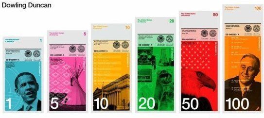
The leading vote-getter for this year's competition (pictured below) was submitted by British duo Dowling Duncan, which features a unique vertical design.

Why a vertical format? "When we researched how notes are used we realized people tend to handle and deal with money vertically rather than horizontally," they note on the Dollar ReDe$ign Project's website. "You tend to hold a wallet or purse vertically when searching for notes. The majority of people hand over notes vertically when making purchases. All machines accept notes vertically. Therefore a vertical note makes more sense."
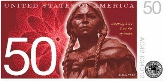
Mark Gartland submitted the entry below, entitled "America Today." The $50 bill features (pictured below) Sacagawea, the native American Indian who acted as Lewis and Clark's interepreter and guide. Noting the "cosmetic drabness" of the current dollar bill, Gartland selected various historical icons from including Benjamin Franklin, Abraham Lincoln and President Obama to represent the "diverse fabric" of the U.S.

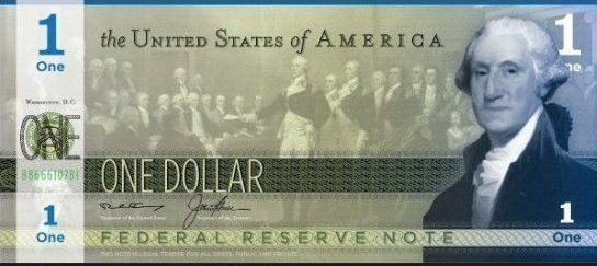
Self-taught web designer Sean Flanagan submitted "Moving Forward, Looking Back," (below) which hews to many of "base color, size and orientation" of the classic dollar bill, but offers more than a few pleasant upgrades. Flanagan also utilized only American-designed typefaces and says his design would require at least "three different layers of solid ink," a preemptive strike against counterfeiting.

If these money makeovers weren't enough, The Dollar ReDe$ign Project has even circulated a petition to get the U.S. government to seriously consider their ideas. Which of these designs is your favorite?
===
To be honest those designs all look pretty good. I don't like the idea of Obama being on a dollar bill before he's even completed his first term, but other than that, I think the vertical format is my favorite, just for the sheer uniqueness of it. The third format is my second and frankly I think it'd be the most likely to work since it looks the most like our original format. We Americans are very slow moving when it comes to change.
One last thing:
"Our great 'rival', the Euro, looks so spanky in comparison it seems the only clear way to revive this global recession is to rebrand and redesign."
That is the gayest sentence I have ever read. Not that there's anything wrong with that.
_________________
Current Avatar commissioned work by Seiken Arts.
Rest in peace, old avatar. |
|
| Back to top |
|
 |
chicken
manifested spam
Level 17: Jealous Spirit
Rank: Resident


Joined: 17 Dec 2004
Posts: 1972
 7,352 7,352
Location: everywhere and nowhere at the same time Oô
|
 chicken Posted: Sun Sep 19, 2010 6:46 am Post subject: chicken Posted: Sun Sep 19, 2010 6:46 am Post subject: |
 |
|
i'd also choose the vertical design. looks pretty good though i dont recognize the man on the 100 dollar bill.
also, about your "gay sentence"  the euro isnt THAT cool and nice and stuff. i'd SO appreciate it, if we had 1-euro-bills and not coins >_> my coin pocket in my wallet often almost explodes because i got so many coins and it makes it a pain in the ass to sit on it - literally. the euro isnt THAT cool and nice and stuff. i'd SO appreciate it, if we had 1-euro-bills and not coins >_> my coin pocket in my wallet often almost explodes because i got so many coins and it makes it a pain in the ass to sit on it - literally.
and about the obama-note: i can see why you are objecting. i personally am divided with my opinion. on the one hand, he IS different - in many ways. on the other hand, you guys had to have former presidents on your money, those guys, that helped build the nation in its early days and such so i guess it must be somehow hard to not have them again. for me, i dont really care whats on my bank notes. i actually couldnt tell off the top whats on the euro notes so whatever.
_________________

winner of the following awards:
Biggest Spammer
Most Annoying Poster
the Pie Award 
Funniest Poster
posting more than one exclamation mark is a sign for mental disturbtion...

yay for jase  |
|
| Back to top |
|
 |
Jason Tandro
Level 20: Guardian of Pandora
Rank: Moderator


Joined: 04 Dec 2004
Posts: 6491
 8,169 8,169
Location: Tiptoeing the line between confidence and arrogance.
|
 Jason Tandro Posted: Sun Sep 19, 2010 7:24 am Post subject: Jason Tandro Posted: Sun Sep 19, 2010 7:24 am Post subject: |
 |
|
| chicken wrote: | | i'd also choose the vertical design. looks pretty good though i dont recognize the man on the 100 dollar bill. |
Franklin Delano Roosevelt, the president who got us through the Great Depression and set up Social Security, not to mention was around through much of World War II.
Hmm... Obama on the $1, FDR on the $100. A teepee on the $5. I wonder if the guy who designed this was a Democrat?
| Quote: | | and about the obama-note: i can see why you are objecting. i personally am divided with my opinion. on the one hand, he IS different - in many ways. |
Yeah, most of our former presidents had skill and experience. 
_________________
Current Avatar commissioned work by Seiken Arts.
Rest in peace, old avatar. |
|
| Back to top |
|
 |
Freedan
Level 19: Soul Blazer
Rank: Resident


Joined: 15 Feb 2005
Posts: 3856
 10,167 10,167
Location: Ontario, Canada
|
 Freedan Posted: Sun Sep 19, 2010 9:38 pm Post subject: Freedan Posted: Sun Sep 19, 2010 9:38 pm Post subject: |
 |
|
I question putting Obama on a bill. The other bills involve historical figures or landmarks... something of cultural significance. Obama, love him or hate him, is still the active President, and hasn't been for very long. He hasn't had time to do much in the way of importance.
That said, at first I thought those designs kind of looked like play money, but after looking at them more carefully, it doesn't seem like such a bad idea. The vertical design looks pretty good, and they have a point about how bills are always handled vertically. If nothing else, it's a small (if ultimately unimportant) measure of change that people could get behind. 
_________________
 
 |
|
| Back to top |
|
 |
psychokind
fuck yeah!
Level 19: Soul Blazer
Rank: Resident


Joined: 06 Feb 2008
Posts: 3507
 10,566 10,566
Location: Germany
|
 psychokind Posted: Sun Sep 19, 2010 9:55 pm Post subject: psychokind Posted: Sun Sep 19, 2010 9:55 pm Post subject: |
 |
|
the last one, but the number has to be way larger 
_________________
 |
|
| Back to top |
|
 |
Reshi
Level 4: Living Statue


Joined: 14 Aug 2010
Posts: 47
 82 82
Location: Shifting through Worlds
|
 Reshi Posted: Sun Sep 19, 2010 10:23 pm Post subject: Reshi Posted: Sun Sep 19, 2010 10:23 pm Post subject: |
 |
|
I like the last one most if it comes to design.
But vertical may be rare but not unique. I've been using vertical notes to pay for over a decade now =) |
|
| Back to top |
|
 |
Mantaray
Level 14: Chariot
Rank: Resident

Joined: 27 May 2009
Posts: 824
 6,635 6,635
|
 Mantaray Posted: Mon Sep 20, 2010 1:57 am Post subject: Mantaray Posted: Mon Sep 20, 2010 1:57 am Post subject: |
 |
|
if i really had to choose, i'd say the third design looks best to me. and vertical is okay, too. but i dont think i agree with changing the money design all of a sudden. for those of us saving up money without bank accounts, would it be possible to trade them in for the new design? would that make the old bills obsolete? (the kids with allowances saved up would suddenly be poor again xD) and it would sure take awhile to switch out every junk food machine for the new design... heh
i dont really like obama being on the dollar bill if he hasn't done anything extraordinary like the other presidents on the old bills did. all he is right now is a friendly african-american guy with a powerful speech voice. that's the only reason everyone likes him so much, with the fact that he became the president right after bush, the guy everybody hated. though obama DID put in a lot of effort at first to make the difference he planned on, he kind of... lazed out of it, for lack of better words :\ so far, he has not proven himself. congress is probably spoiling him as well, so i dont think he's been getting a lot of constructive criticism either |
|
| Back to top |
|
 |
Jason Tandro
Level 20: Guardian of Pandora
Rank: Moderator


Joined: 04 Dec 2004
Posts: 6491
 8,169 8,169
Location: Tiptoeing the line between confidence and arrogance.
|
 Jason Tandro Posted: Mon Sep 20, 2010 3:12 am Post subject: Jason Tandro Posted: Mon Sep 20, 2010 3:12 am Post subject: |
 |
|
@sora-mage: We still use $20s that were printed in the early 1900s. Old bills will not suddenly lose value. Most likely they'll be filtered out at any financial institution and anywhere you spend that money you will recieve your change in the new bills.
_________________
Current Avatar commissioned work by Seiken Arts.
Rest in peace, old avatar. |
|
| Back to top |
|
 |
EverPhoenix
Level 19: Soul Blazer
Rank: Resident


Joined: 19 Mar 2008
Posts: 4183
 8,804 8,804
Location: Behind a screen
|
 EverPhoenix Posted: Mon Sep 20, 2010 3:31 am Post subject: EverPhoenix Posted: Mon Sep 20, 2010 3:31 am Post subject: |
 |
|
id have to say in terms of design, i like the last one the most. im not particularly fond of any of them - the first one looks like it could well be monopoly money, while i just dont like the 2nd one for some reason. third one needs to be a bit less.. colourful? it seems too bright. if they got rid of the white on it (on the left side), it would look good.
i have an american dollar bill in my wallet from when i visited USA with my parents, and i dont see anything wrong with the old design
_________________
  |
|
| Back to top |
|
 |
Jason Tandro
Level 20: Guardian of Pandora
Rank: Moderator


Joined: 04 Dec 2004
Posts: 6491
 8,169 8,169
Location: Tiptoeing the line between confidence and arrogance.
|
 Jason Tandro Posted: Mon Sep 20, 2010 4:26 am Post subject: Jason Tandro Posted: Mon Sep 20, 2010 4:26 am Post subject: |
 |
|
There's nothing wrong with it by my way of thinking but our society is living under the delusion that everything old must go.
Frankly I like the design of the Japanese Yen, especially the coins.

_________________
Current Avatar commissioned work by Seiken Arts.
Rest in peace, old avatar. |
|
| Back to top |
|
 |
Miss Prime Blue
Prime Blue
Level 14: Chariot
Rank: Resident


Joined: 02 Jan 2005
Posts: 750
 3,232 3,232
Location: Crystal Holm (USA, NY)
|
 Miss Prime Blue Posted: Mon Sep 20, 2010 6:04 am Post subject: Miss Prime Blue Posted: Mon Sep 20, 2010 6:04 am Post subject: |
 |
|
I'm not used to american bills being so colorized. I think they look interesting, though.
I usually like foreign bills because they are usually more creative and colorful to look at.
_________________
People live on because they forget about unpleasant things. |
|
| Back to top |
|
 |
rayim
Legend shall speak
Level 6: Stone Golum


Joined: 16 Sep 2010
Posts: 80
 131 131
|
 rayim Posted: Mon Sep 20, 2010 6:06 am Post subject: rayim Posted: Mon Sep 20, 2010 6:06 am Post subject: |
 |
|
| Jason Tandro wrote: | ... but our society is living under the delusion that everything old must go.
|
I know! And this happens in Europe too. It's so sad, but, oh well, i hope it's all about cycles and sometime the things you could call traditional (but not ultra-traditional or other b.s.) will come back.
_________________
// APodEIctIc TIMe visoR |
|
| Back to top |
|
 |
Jason Tandro
Level 20: Guardian of Pandora
Rank: Moderator


Joined: 04 Dec 2004
Posts: 6491
 8,169 8,169
Location: Tiptoeing the line between confidence and arrogance.
|
 Jason Tandro Posted: Mon Sep 20, 2010 10:14 am Post subject: Jason Tandro Posted: Mon Sep 20, 2010 10:14 am Post subject: |
 |
|
Oh, I want to change my vote. I just realized (as stupid as this sounds considering they're right in the picture) that the vertical bills would also be different sizes. That's just stupid. Might make organizing them easier, but wtf?
Edit: @Rayim: There are some people out there who still hold to traditional values.
_________________
Current Avatar commissioned work by Seiken Arts.
Rest in peace, old avatar. |
|
| Back to top |
|
 |
EverPhoenix
Level 19: Soul Blazer
Rank: Resident


Joined: 19 Mar 2008
Posts: 4183
 8,804 8,804
Location: Behind a screen
|
 EverPhoenix Posted: Mon Sep 20, 2010 10:35 am Post subject: EverPhoenix Posted: Mon Sep 20, 2010 10:35 am Post subject: |
 |
|
| Jason Tandro wrote: | Oh, I want to change my vote. I just realized (as stupid as this sounds considering they're right in the picture) that the vertical bills would also be different sizes. That's just stupid. Might make organizing them easier, but wtf?
Edit: @Rayim: There are some people out there who still hold to traditional values. |
every single currency im aware of uses notes of different lengths. its how blind people can tell them apart. that and ATMs
_________________
  |
|
| Back to top |
|
 |
tay120n64
The Koholint Knight
Level 19: Soul Blazer
Rank: Moderator


Joined: 19 Jul 2007
Posts: 3186
 7,572 7,572
Location: North Castle, Hyrule
|
 tay120n64 Posted: Mon Sep 20, 2010 6:04 pm Post subject: tay120n64 Posted: Mon Sep 20, 2010 6:04 pm Post subject: |
 |
|
I like the latter. US currency has its own flavor, and we really shouldn't deviate from that to be like other currencies. That's just dumb. I like the idea of changing the dollar, and I like the soft addition of color in the latter bill.
I REALLY don't like the idea of having Obama or Roosevelt on the bill. Keep the presidents we have where they belong. I don't think we should change WHAT is on the bill, just HOW it looks.
I like the subtle changes our bills have experienced over the past 20 years, and I think that trend should continue. We don't need a drastic change in our bills, not because I'm against change, but just because there are elements of our society that need to remain at least partially constant. Also, could we, as a nation, even afford the massive cost of new currency right now? Think about all the machines that would have to be re-calibrated to accept a new type of bill. A subtle change would only cost manufacturing fees, but a major overhaul would cost an incredible amount.
_________________

 |
|
| Back to top |
|
 |
|